electrica
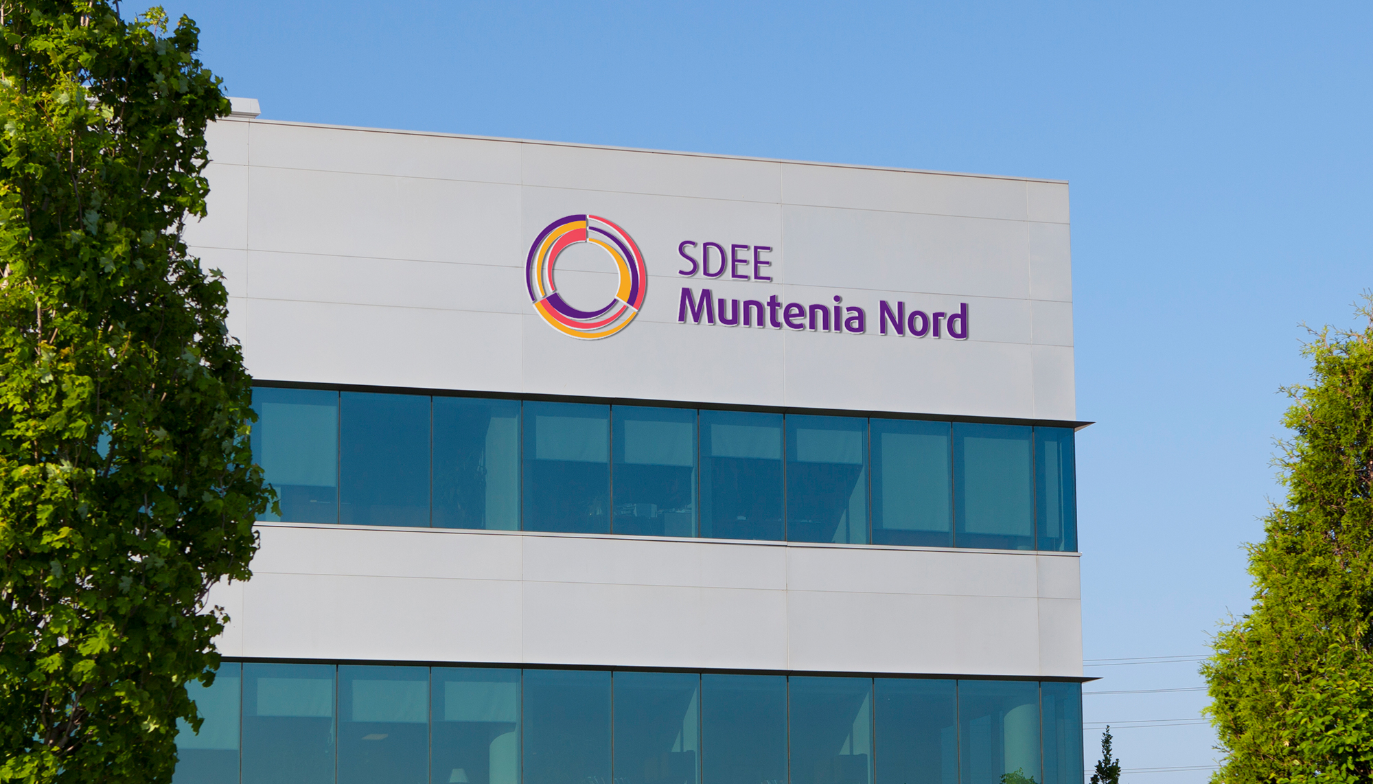
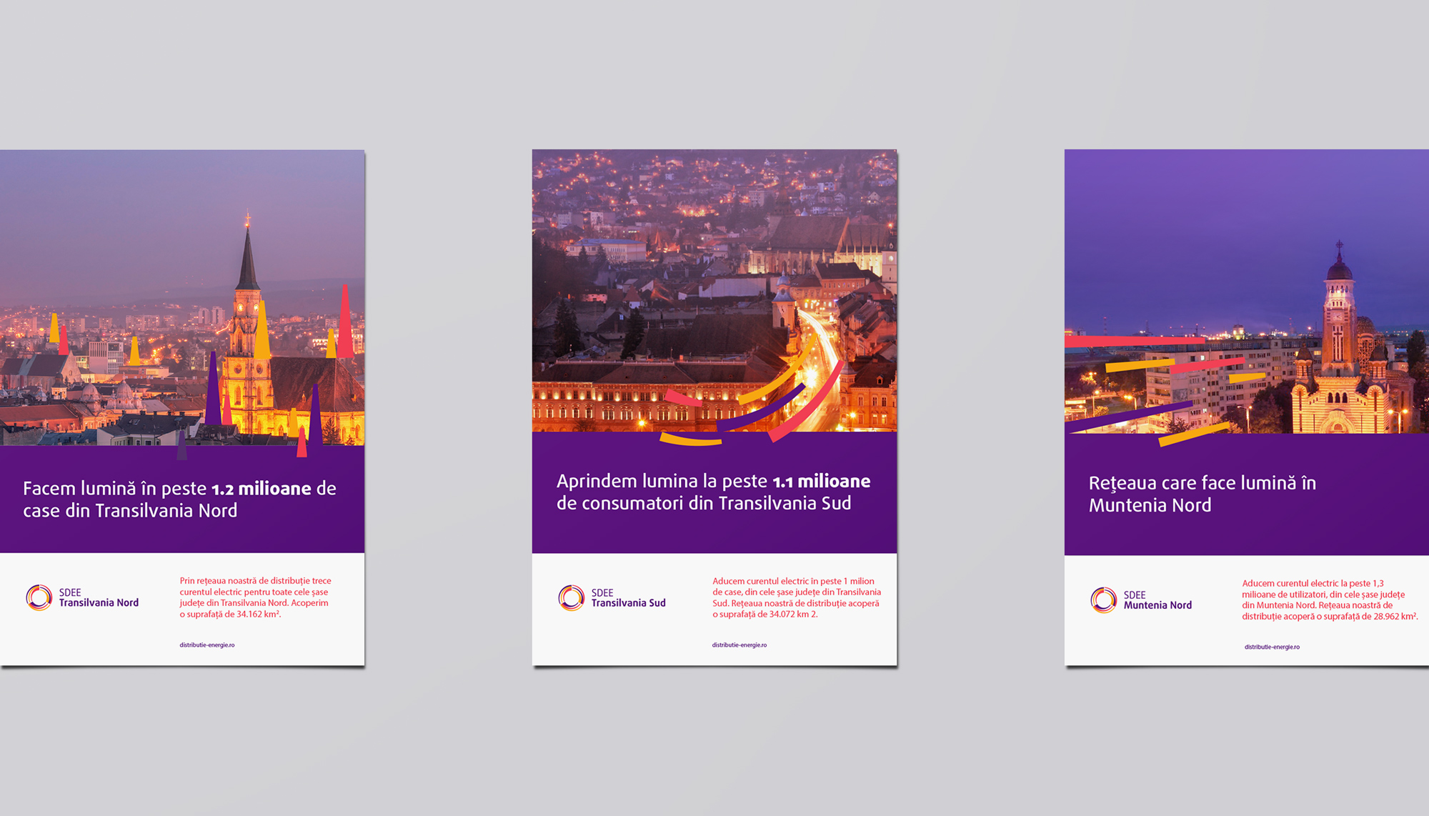
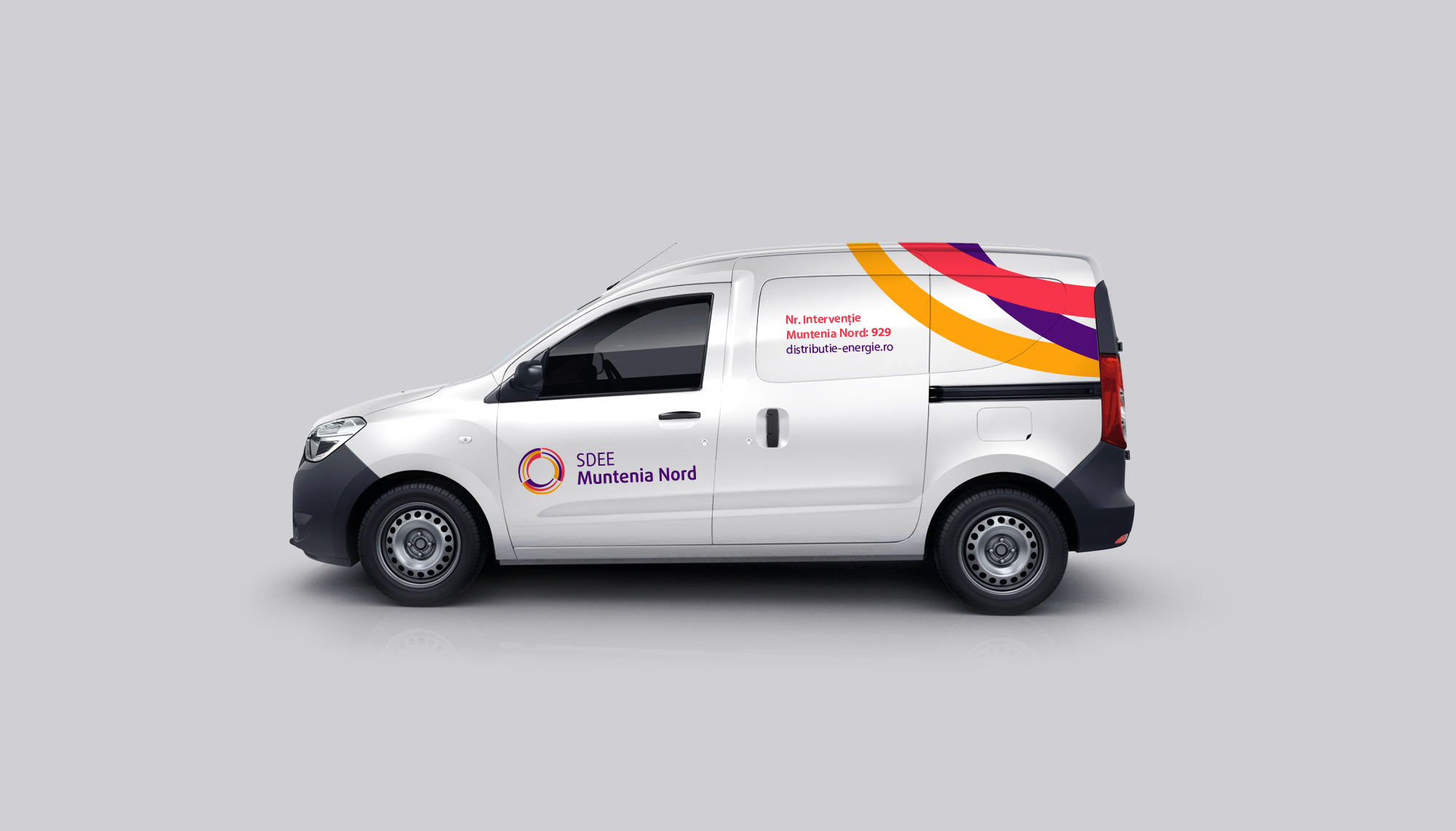
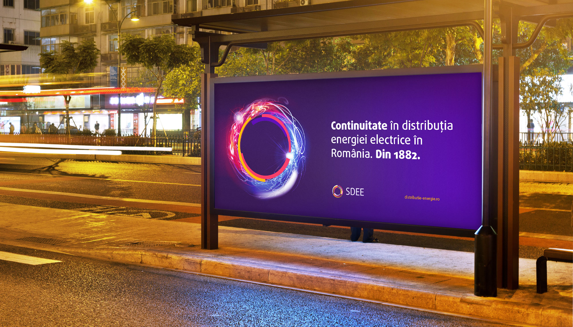
Identity redesign for one of Romania’s top energy distributors. Due to regulations, SDEE needed to differentiate visually from the parent company Electrica.

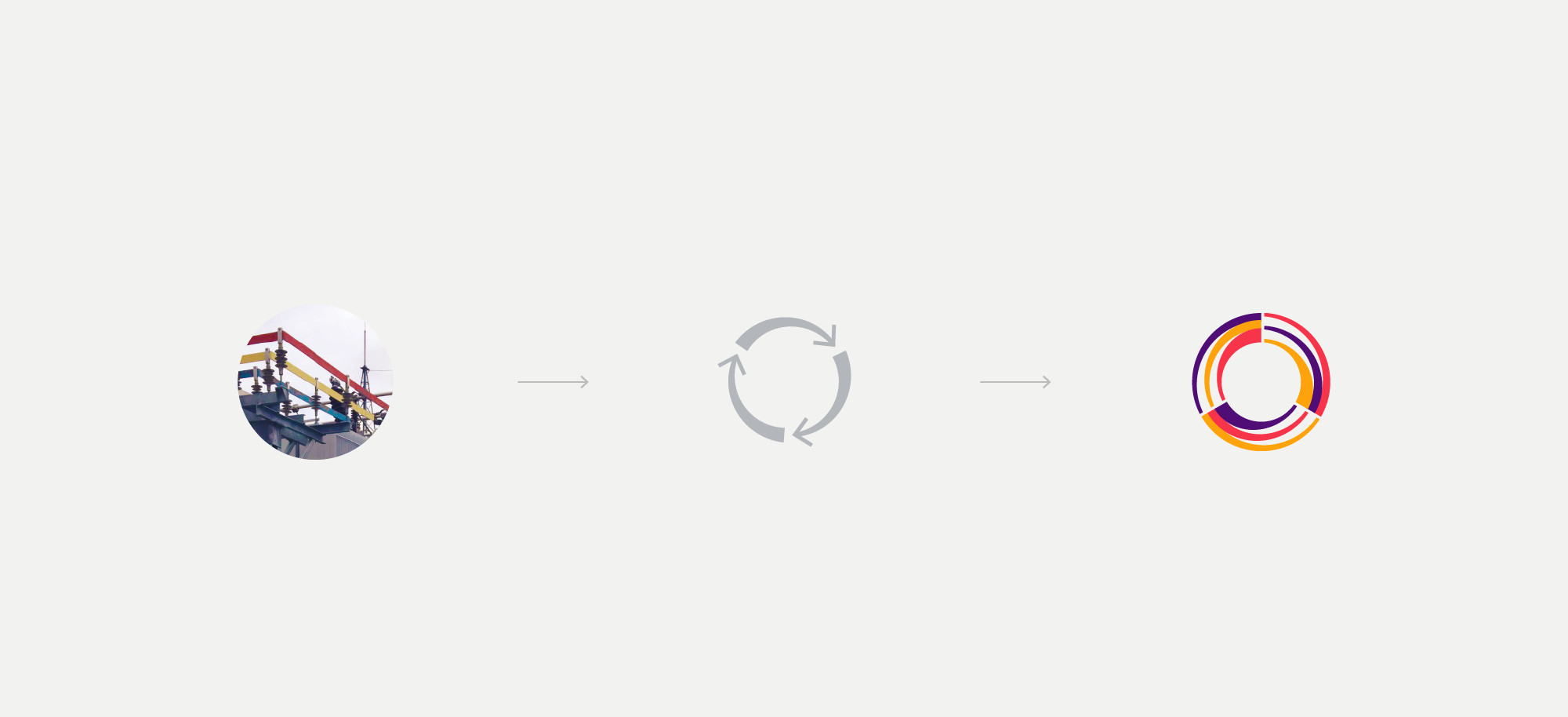
An abstract symbol was created to capture the idea of endless moving energy. The distinct colors represent the three phases of the electrical current and the three regions served.

year: 2016
identity design proposal, agency: brandfusion

